ds Smart Home App

Role

Lead UX & UI & Interaction Designer

Activities

Setting up design environment and tools

Lead concept

UI Design

Inforamtion Architecture

Prototypes

Usability Tests

Guidelines for Design System

Research

Tools

Figma

Protopie

Sketch

Photoshop

Balsamiq

Rotato

Team

Distributed Team - Zurich, Bern, Belgrade, Frankfurt - Team of 10 (2 UX, 5 Devs, PM, PO, Account Manager)

Achivement

Created a smart home app with the following three goals successfully achieved:

  • making smart home technology more accessible
  • Creating an easy-to-use and frictionless smart home experience for diverse user groups
  • Using scalable design principles to create a scalable application

The app was designed for iOS, Android, tablets, & web

app store badge play store badge

dark | light

Project Background

Collaborated with digitalSTROM to build a smart home app where users can connect and control all their smart home devices and have an overview of their home. With the app, users are able to set right scenarios according to their needs from wherever they are.

digitalSTROM partnered with different IoT device manufacturers like Philips Hue, V-ZUG, Smarter to enable third-party device control.

The digitalSTROM technology also allows users to incorporate none smart devices into the smart home system by connecting them to a digitalSTROM switch. This means that any pluged in device can at least be turned on or off with the app.


Goals

High Level Goals

1

A Smart Home App which is easy to use and well structured

The app should work as a gateway in making the smart home technology more accessible and fun for the users.
Our research showed that the smart home app is most likely going to be used on a daily basis to control multiple devices. Thus, keeping the app experience simple, easy, and well structured is very crucial.

2

Focusing on Scenarios

With an option of controlling individual devices, users can also control and orchestrate groups of devices with a single click for example  movie night scenario  --> dim lights, tv turns on, and shades go down. Users should be encouraged to create and use scenarios.

3

Scalability

  • New IoT devices should be able to be incorporated easily
  • White Label Solution - the app should be designed so that other companies can push their corporate design on top of it.
  • Scalable interaction patterns for device controlling
PERSONA

Understanding the User

As much as Smart Homes and Internet of Things are used as buzz words in our tech world, for many of our households, incorporating the technology into our daily routine can be scary and uncomfortable. Changing our habits accordingly to the new system can mean that the new technology can really have a big impact on our lives. This was the biggest challenge for us as a designer: Building the right app for the right people. Users can be family members ranging from kids to elderly members. The app should be accessible to everyone regardless of their age or their understanding of technology. Therefore, it was crucial for us to understand our users, their daily routines and behaviors to find the right solution, balance, and offer features that can provide benefits to everyone.

Important things we had to keep in mind:

  • A broad range of people in different age groups with different goals
  • The app is going to be used not only by new users but also by users who are transferring from the previous version of the app. Since the budget for Release 1 is limited, not all features will be implemented and transfering users might miss some key features. We tried to figure out the most important features for the first release by doing interviews with both the current and potential users.
  • Users might be using the app on a daily basis - it should help them to save time and ease the frustration and let them control their smart home with confidence.
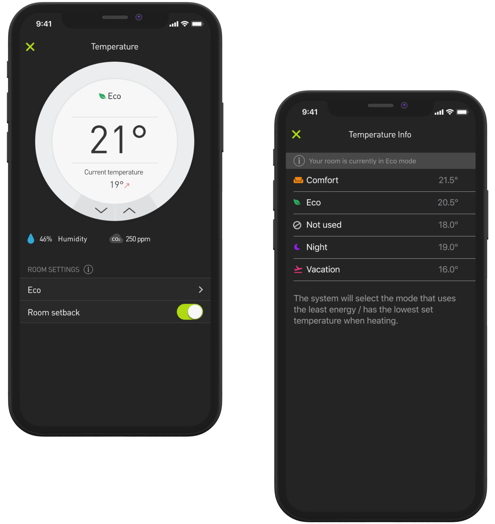
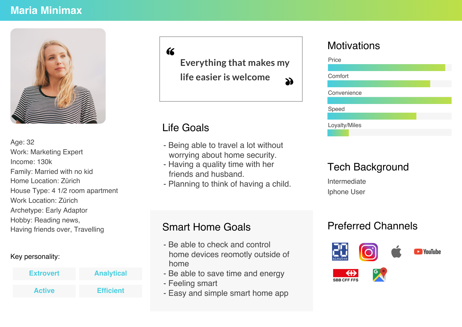
Persona

In order to understand our users, first, we interviewed five current smart home users to better understand their needs and the pain points. Here, we were able to find out common needs and derive our persona Maria Minimax.
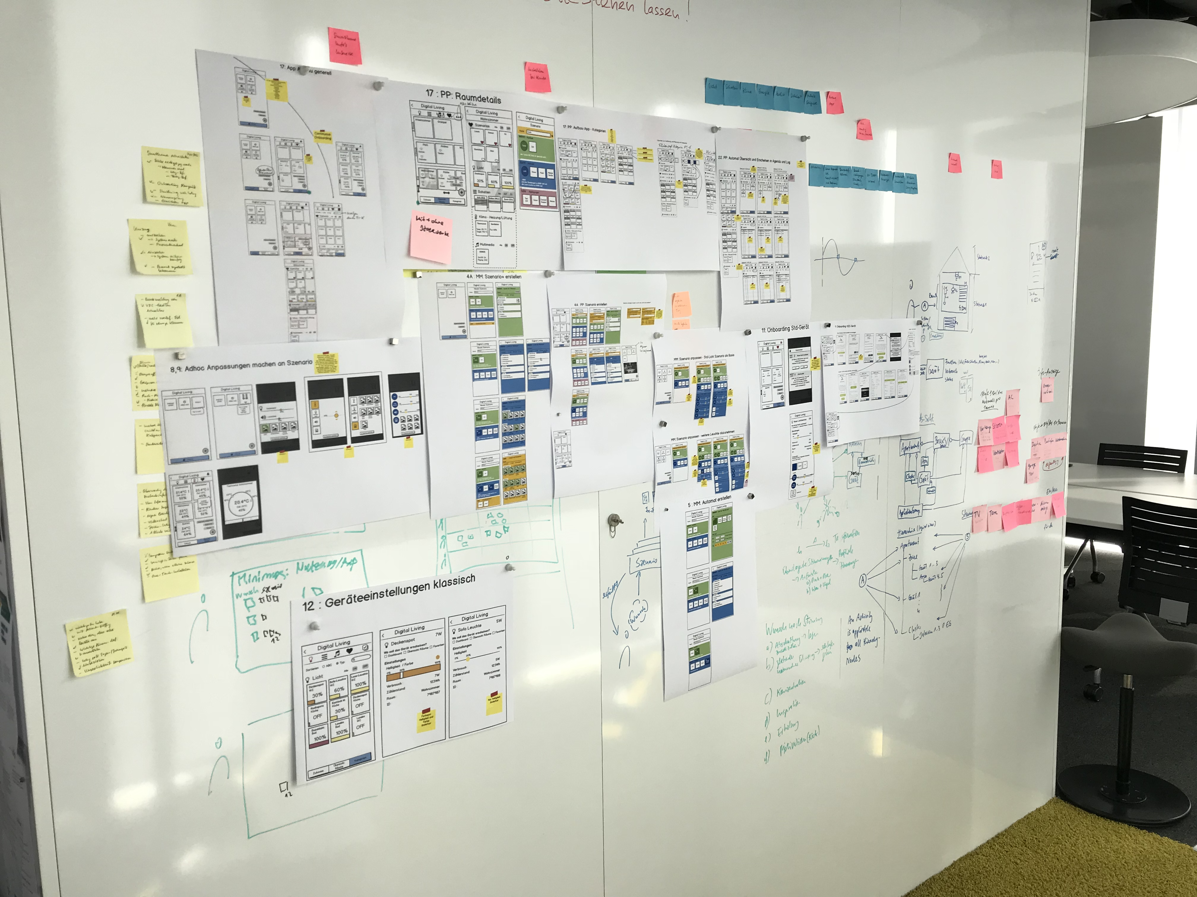
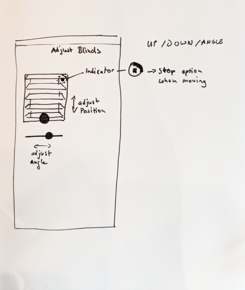
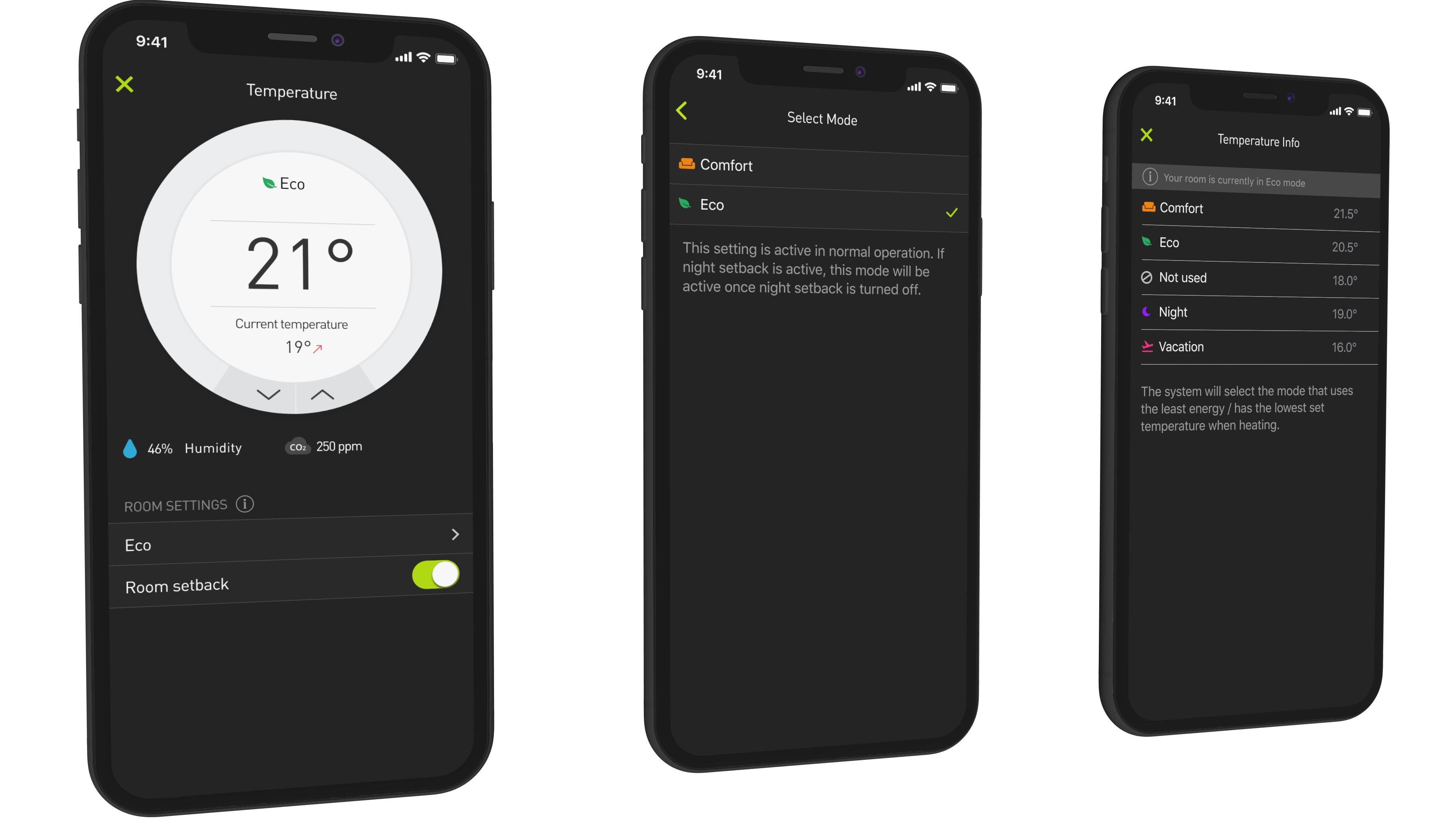
Click to enlarge

FLOW

Information Architecture & Wireframing

Click to enlarge

When creating the information architecture for this application, it was very interesting to see how different each interviewed individual's mental model was. For example, the option to create a scenario was expected by some users to be found in the room overview screen, by some on the landing page and by a little group within the settings menu. Even after multiple interviews, there was no clear answer to this question, so we decided to have these options on multiple screens like the landing page and the room overview screen.
A later usability test showed that users were very happy with this solution and saw it as convenient to have the option to create scenarios from different locations of the app.


DESIGN SYSTEM

The Importance of a Design System for Collaboration and Scalability

Since this product has a high complexity and will run for a couple of years with regular updates and grow with new devices supported, we heavily relied on a design system to stay organized. It helped our team to collaborate and quickly find and use the right components, patterns, and styles. We used Figma to design the app and build a consistent component library. Having a well structured component library helped us to quickly update any changes onto the entire design. It saved us a lot of time when creating new screens, which had the same or similar components. Our developers were also able to view our Figma design files, and they always had one source of truth for all assets, screens or user workflows.

A unified design language was very important in providing consistent experiences to our users when controlling devices or navigating the app. It should always feel familiar, intuitive and a user should be able to reuse gained interaction- or design-knowledge learned, from one place in the app in another place. We not only wanted to make the app feel familiar and intuitive but also help users to feel confident and smarter whenever they use the app.


PROTOTYPING

Details matter - Prototyping can help to communicate complex designs

Some UIs needed detailed interaction prototyping to clearly communicate how they will work. In such cases, I first sketched out the interaction patterns to give the team a rough idea on how the UI should look like and gathered some feedback and inputs. Based on those sketches and feedbacks, I then prototyped those patterns to give everyone a clear understanding of the complete interaction and complexity. These steps were very valuable because they helped a lot with estimating development time and effort as well as bringing everyone on the same page. This temperature control prototype was built with ProtoPie, which turned out to be the fittest tool to visualize and share this specific interaction after some explorations with other tools.

sketchUI

Visualization of each element of the UI to help estimate implementation complexity

FINAL DESIGN

Final Design Examples

Create Scenarios

We did field studies on how people live their lives at home and how they interact with their homes. The result of our observations and interviews was, that many people use multiple devices together to create the right mood at home. For example, when watching tv, people dim the lights vs bright lights and low background music for studying. We wanted to make these moods easy to create and available by just one click. Those moods are called scenarios.
When creating a scenario a user is guided through the process of creating such, step by step. Giving the option to combine many devices to work together and tweak each of them individually.
Interviews also showed that the mental models when it comes to creating scenarios were strongly reflected by two approaches, one where users first pick the device types then the room then adjusting those devices. The other approach is by first selecting the room then the device type and finally do the device adjustments. We wanted to provide users with both possibilities.
Scenarios can be mapped and applied onto an existing switch in your home so that users can conveniently use it when they don't have their mobile phone around and also to make the experience more natural.
flow_switch

Cockpit

Cockpit view gives users an overview of system information like energy consumption, alarm status, surveillance camera and more. If something is alarming at home, it will show up in the cockpit where users can quickly react accordingly. This feature gives users a sense of safety and security in their homes.
cockpitSketch

Controlling Blinds with a simple gesture

The blinds control replicates its real-world movement. Open and close blinds by swiping up or down and change angles by swiping left or right. As security measurement, after every movement/adjustment, a stop spinner will be shown, indicating that the blinds are in motion and giving the option to stop them at any time.

Quick edit

To quickly edit devices and scenarios, users can 3D touch a tile or long-pressing. This interaction makes it easy, fast and keeps the UI decluttered. At first, I wasn't sure if users will find this interaction intuitive enough but today it is a widely used pattern. However user tests showed mixed results, some got it right away but for some, it took a while to figure. To highlight this interaction, we decided to have a short onboarding screen/video featuring how to edit devices and scenarios.

Multi home

Some users might have multiple homes. In the settings, users can easily add and switch between multiple homes. In addition, the app can be used in smart hotel rooms or Airbnb. Traveling to Tokyo and adding your hotel room to your smart home app could make your stay feel more like home and makes controlling the room a bit more familiar.

Thermostat UI Final Implementation

After creating a first concept of the temperature UI with its interactions, we figured it would cost too much to implement. As a next logical step, we stripped down all components that added complexity but still tried to have a final result which is similar and still provides all the information and adjustment options. We were very happy with the final result and this process showed the team how important it is to try, test, negotiate and iterate our product.

iPad

By not just scaling the UI from mobile to tablet but designing the UI to use the extra space on larger screens, users can see more options at a glance on their tablet.
IN THE WILD

App in action


Feedback we received after the release

The app was well received by users after publishing the app to the app store.

ratingtitle
ratings